

“Yajiuma no Mori” will cover a wide range of topics that are not limited to news and reviews.

“Material You” design (Google Material 3) that started rolling out from “Google Chrome 117”
It seems that the Material You design (Google Material 3), which started rolling out in Google Chrome 117, has finally been reflected in almost all environments. Since last month or so, some people may have been surprised to see that Chrome's appearance changed when they restarted it for an update.
So, in this article, I'd like to pick out and present some of the things that have changed in Material You. Let's take full advantage of the new design of “Chrome”!
Customizable themes
“Material You” is used in Google's “Pixel” series of Android devices, which extracts colors from the device's background and determines the color scheme of widgets and apps based on that color palette. In the case of Chrome, you can select your preferred color palette from the sidebar that appears when you press the button at the bottom right of the new tab page (chrome://newtab). When a color palette is selected, the color of the tab bar etc. changes, but this can also be changed per profile. This is useful for things like differentiating between business and personal accounts.

Choose a color palette and create a stylish color scheme for tab bars, etc.
In addition, the integration with the operating system has been enhanced, and Chrome can not only independently determine light and dark themes, but also respect system settings.
Easy-to-understand icons and friendly design
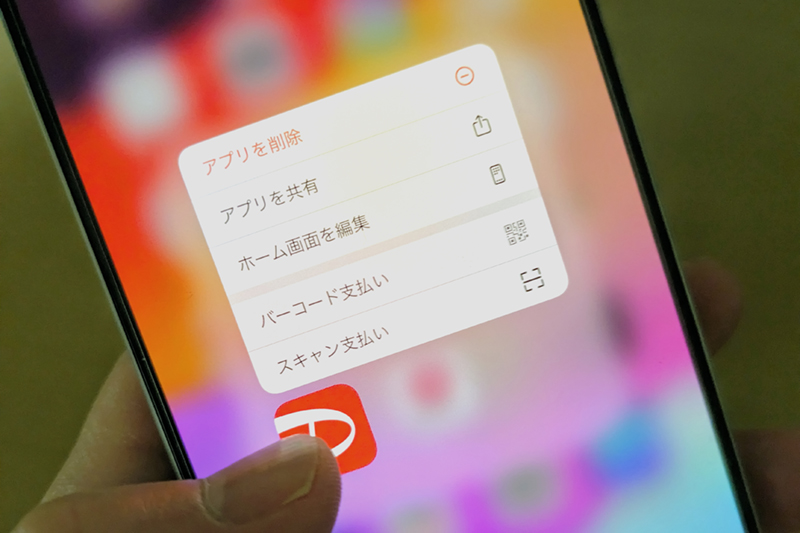
In the “Material You” design, the icon icon has also been updated, increasing the number of places the icon is used. For example, if you open the menu[⁝]In the top right corner, you will see that almost all commands have icons attached to them. Text presentation also appears to have been improved, with larger margins and improved visibility.

Compare old and new lists[⁝].
In addition, the edges of the toolbar have now been rounded, giving it a friendlier appearance. In Windows 11, the windows themselves have rounded corners, but they appear to be identical.
The tab drop-down menu is located at the top left of the window.
Finally, the tab dropdown menu has been moved from the top right of the window to the top left. This dropdown menu is useful if you have too many tabs open and the tab bar looks like a saw. From here, you can narrow your tabs by keyword or restore tabs you accidentally closed.

The tab drop-down menu is located at the top left of the window.

“Travel maven. Beer expert. Subtly charming alcohol fan. Internet junkie. Avid bacon scholar.”
More Stories
Instantly launch the desired function by long pressing on the iPhone app icon – Tested with 40 apps – Impress Watch
A full gameplay commentary video has been released for the latest SteamWorld series “SteamWorld Heist II”, which was released on August 8th «doope! Local and international game information website
5 peripherals that expand the possibilities of innovative PlayStation functions that upend the common sense of home gaming consoles |